In this tutorial, we’ll show you how to maximize your research potential with one of GuruFocus’ most powerful tools: the Stock Summary page. Located on the first page of any stock you search, this page is rich with financial information and unique GuruFocus insights that will take your investment analysis to the next level.
The stock summary page includes both readily available company financial information as well as information boxes filled with GuruFocus calculations and analysis. This page is designed to be an at-a-glance summary; if you are seeking comparative analysis, head to Learn more about each one and how they can shape your investment strategies below!
View a high-level overview of the company
In the very top section of each stock summary is a high-level summary of the stock, packed with information such as the stock’s current price, the positive signs and negative warning signs, critical statistics such as the P/E and P/B ratios, and more. Underneath the stock price is GuruFocus’ own predictability score, and to the right is an aggregate GF (GuruFocus) score.

Lastly, on the bottom left, you’ll find an array of flags that act as quick switch buttons for alternative stock exchanges. Clicking each flag brings you an entirely new set of metrics and statistics for how the stock is performing around the globe.
What is the GuruFocus Score?
Our proprietary GuruFocus Score is a statistic from 0-100 that is composed of rankings over a company’s profitability, growth, GF value, financial strength, and momentum. These rankings have been shown to have a positive correlation with the long-term performance of stocks. Each individual ranking is placed into a pentagon chart, in which the further away the point is from the center of the chart, the better the stock scores based on that parameter. The area of the pentagon indicates the GF Score. The bigger the area is, the higher the GF Score is. Backtesting has shown that a higher rank of any of these parameters is correlated with better stock performance.
Dive deeper into the GF Score’s metrics
Financial Strength
Nested in the top left of the summary is the Financial Strength section, with color-mapped information about a company’s financial performance in relation to other companies in the industry and its own historical performances. If you’re unsure about whether or not a higher or lower number is better, the color of these bars throughout the entire page provide visual cues as to how well a company is doing on that specific metric. You can hover over each bar or click on the gray graph icons to learn more about each ranking.

For example, here Apple (AAPL) has a 7/10 financial strength score. If we hover over the red bars, you’ll find that Apple’s Debt-to-Equity ratio is ranked worse than 94.52% of 2118 companies in the hardware industry, but it has an Piotroski F-score of 8, which usually indicates a very healthy situation.
In addition, if you would like to know more about a specific term, you can click on the said term to view a definition page for the said term.
Profitability Rank
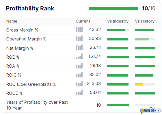
Next, you’ll find the profitability rank, which ranks how profitable a company is and how likely the company's business will stay that way. Using the color-mapping system, you can determine how good a company’s margins and returns are with a single glance. Click and hover over each bar to find exact numerical details, or view its overall ranking (based on these metrics). In this example, Apple’s rank is a 10, which means that it is both incredibly profitable and will more than likely stay profitable.

Growth Rank
Immediately after the Profitability Rank is the Growth Rank, which measures the growth of a company in terms of its revenue and profitability. A company with a high growth rate is more likely to perform well in the long-term. In the box you’ll find the company’s growth ranking (calculated based on these metrics) as well as a variety of growth metrics based on revenue, earnings, free cash flow, and book value growth.

Momentum Rank
Following Profitability is the Momentum Rank section, which factors in a stock’s rate of change in order to determine positive or negative trends. A company with a 10/10 momentum rank, as shown here, is close to the 70th percentile of momentum ratios due to the non-monotonic correlation between the momentum ratio and the stock performance. In the Momentum box, you’ll find the stock’s relative strength index (RSI) across different time frames. For more information about the difference between growth and investing, check out this article by our trusted editorial team.

GF Value Rank
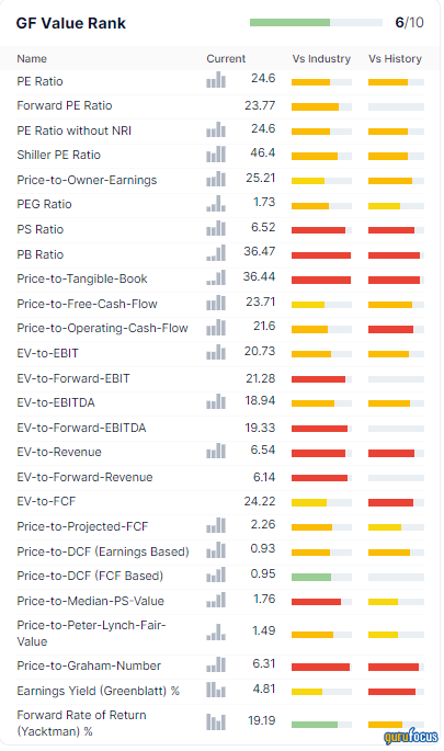
Lastly is GuruFocus’ own Value Rank, which is determined by a proprietary metric calculated based on historical multiples adjusted for a company's past returns, growth, and future performance estimates. Stocks with the highest GF value rank are found in the third-cheapest percentile of our proprietary metric, as they have been found to perform the best over a full business cycle (stocks with the cheapest valuations might not be good deals, but rather poorly-run companies that aren’t worth an investment). Using a company’s earnings, value, price, and rate of return data, we calculate what a company’s estimated value is and in turn can make conclusions about whether a stock is undervalued or overvalued.

Understand a company’s valuation
Speaking of valuation, in the top-right section of the summary page you’ll find the GF value applied and displayed in a graph; it tells you the relationship between the GF value and the actual price of the stock. The solid black line denotes the past and current GF value, while the dotted line shows an extrapolated future prediction of the stock’s value. Meanwhile, the blue line is the stock’s actual price. The red and green regions represent margins of different evaluations based on the difference between the price and the GF value. A price in the green means that the stock is currently undervalued to some degree, while a price in the red indicates that the stock is overvalued. If a stock falls deeply below the GF Value line, the stock may represent a value trap and should typically be avoided. GuruFocus’ Value Line feature will label a stock as “Possible Value Trap, Think Twice” if the stock’s fundamental data justifies a low valuation. On the other hand, if a stock’s GF Value is significantly above the red area, the valuation is considered “off the charts.”
Another powerful valuation summary lies in the Valuation Box right underneath the graph. This box shows the stock prices relative to a few different valuation matrices, and can give you a rough idea of where the company is traded relative to its value. The different bars represent valuations, and the dotted green line shows the stock’s current price. Although in the status quo, GuruFocus might say that Apple is fairly valued, using the Valuation Box you’ll find that Peter Lynch actually believes Apple is significantly overvalued.
Uncover positive signs and warning signs of a stock before you invest
With so many data points to look at for each company, it may be difficult to know what statistics stand out and should let you know to invest or stay away. In the GuruFocus stock summary, the powerful Warning Signs section takes a thorough checkup through all of a company’s financial and performance statistics to indicate a company’s potential red flags. While these financial statistics are important, they don’t always necessarily mean that you should immediately buy or sell a stock, and it’s important to combine them with your own analysis rather than basing your decisions solely on the warning signs.

GuruFocus provides three different types of warning signs: Good, Medium, and Severe. Here, Amazon (AMZN) has 4 Good warning signs, 3 Medium warning signs, and 1 Severe warning sign. If you click on the warning signs, you can find more detailed information such as what statistics the warning sign originated from and what it likely means about the company. If we click on Amazon here, we’ll find that its severe warning sign tells us that “If a company builds assets at 39.2% a year, faster than its revenue growth rate of 26.7% over the past 5 years, it means that the company may be getting less efficient.”
View detailed financial and earnings statistics
If you want to get a more in-depth look at the earnings and financials of a company than what was given in the high-level overview section, you can simply scroll down to see dedicated boxes for liquidity ratios, dividend yields, analyst estimates, and official company key statistics. Information from company financial reports are also visualized in a series of graphs, showing data from both annual and quarterly earnings reports. From these graphs on Apple’s stock summary page, you can see that Apple has steadily increased its revenue, income, operating cash flow, and free cash flow, but has had dips on its return on invested capital (ROIC). These graphs can also be toggled to show exactly what you are looking for.

See how strong a company is according to Piotroski and Lynch
If you’re looking for undervalued, financially stable companies to invest in, the Piotroski F-Score might be a good starting point. On the stock summary page lies a box with information on all 9 metrics used to calculate this score. A green checkmark indicates that a company has met a certain criteria, and a red exclamation mark indicates that it did not meet said criteria. A play button in the top right also allows you to see how this company’s F-Score has fluctuated over time. Currently, Apple has an F-Score of 7, meaning that it is in a healthy situation.

Another powerful tool at your disposal is the Peter Lynch chart, which compares the stock’s price to the Peter Lynch Earnings Line. To discover the power of this chart, check out this article by our editorial team. Right in the stock summary page, you can change the time frame and Y-axis scale to make the chart fit your needs.
Discover what experts and insiders are doing with the stock
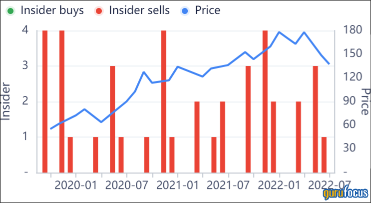
Information is power - and luckily, those with the most information (insiders) have to share their trades regarding their own stock. By looking through the Guru Trades and Insider Trades functionality of the stock summary page, you can see what fund managing experts and company insiders are doing with their shares. In these graphs for Apple, you can observe how certain dips in the stock price correlate to Guru selling. For more detailed information, click “See Details” or navigate to the “Guru Trades” or “Insider” pages.
Graph your own comparative analyses
If you want to see how your current selected stock is doing compared to other stocks, macroeconomic trends, or other sectors, you can use this interactive chart to discover hidden trends or correlations. Just simply add a ticker using the search bar, or click the “+ Economic Data” button to chart a variety of economic data. In this chart, Apple’s stock is being compared to Sonos Inc. (SONO), Vizio (VZIO), Crude Oil, and the 10-Year Treasury Constant Maturity Rate. Below, annualized return rates and total annual return rates are automatically displayed in tables, demarcated by time frame. For even more powerful graphing, navigate to the “Interactive Chart” page.
Catch the latest headlines
If you want to find out what writers and analysts are saying about a company, look no further than the Headlines box. Here, articles are aggregated from top sources across the internet to provide you with even more analysis on earnings statements, information on market trends, buy/sell notifications, and more. Stories are separated by day and labeled with the stock’s performance that day to give you a clearer picture of the market, and headlines dating back years can be found in the “Headlines” page or by clicking “See More.”


